Redesigning MyMTN app to enhance the user experience
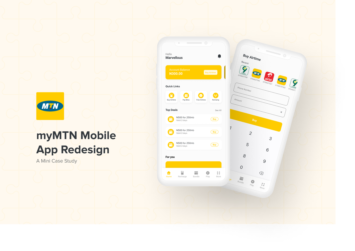

SUMMARY
MTN is a multinational telecommunications company operating in Africa. Being the largest in Africa and operating in over 20 countries it records over 280 million subscribers
My goal is to redesign the famous myMTN App to ease user experience
MY ROLE
Research, wireframe, design
DURATION
5 weeks
The MyMTN App
MTN introduced the myMTN app to serve as an all-in-one self-care app to easily manage your accounts, pay bills, and much more. The goal of the App was to give users a seamless process of managing their accounts but is it??

Why Redesign
I have previously used my bank app to recharge my phone but some days ago, My bank had some downtime and I really needed to recharge my line. USSD was also not an option so I had to download the myMTN app.
Navigating through the app as a user was really difficult. There were inconsistencies with the components on the app. Information flow was quite confusing. Logging into the app was a whole different game. I had to use OTP every single time my app closes.
I also found that many persons had issues with the app as well. With all these numerous complaints and my personal experience, I knew that the design process needed a complete reboot and extensive thinking on the design. So I decided to hop on the challenge to redesign it and make the app a case study
Design Process
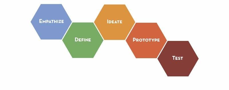
Goals
Before moving forward, I highlighted the goals I wanted to achieve from this redesign. I had to focus more on the UX research than the UI design so I could gain practical knowledge and treat the project as a real-life project
- Highlight/Discover user pain points and issues
- Make improvements to the current user interface and design
- Reduce the number of unnecessary flows needed to achieve a particular task yet achieve the same goal
- Effectively test the redesign to ensure it achieves the initial brand design
To achieve this, I dug deeper to know MTN's reason for the myMTN app in the first place
- Access to manage your MTN account with ease
- Enables you to load airtime for a loved one remotely.
- It is easy to use.
Identify the problem
If I was going to redesign an app, Then I needed to reach out to a bunch of already existing users and find out their pain points. Although I had some personal issues with the app, I needed more.
I reached out to some users of the mobile app to get feedback from them on their experience on the app and some recurring problems I figured were
- Having to enter OTP every time they login in
- Difficulty in navigating the app
- Too much cognitive load on some major screens on the app
- Lack of proper means of reporting error
- The app keeps hanging and loads a lot
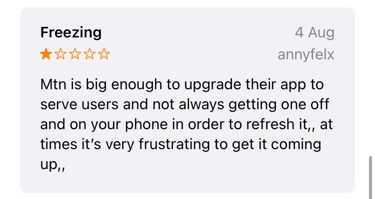
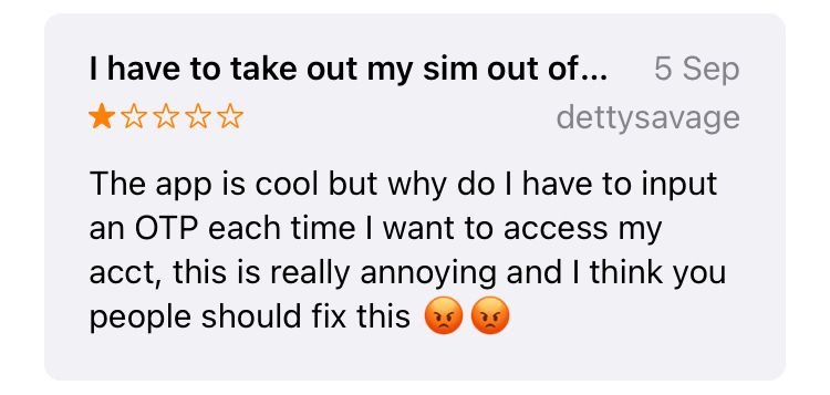
Play Store and App Store reviews
To furthermore carry out my research, I went out to find some reviews on the myMTN app
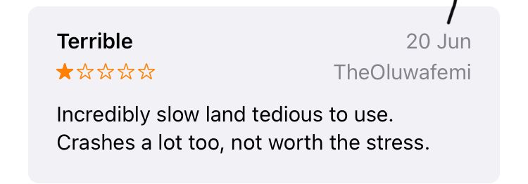
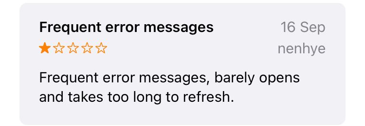
A solution is birthed
From my research made, I had to come up with a working solution to solve the existing problems. Because of the major issue I faced which was time constraints, I knew I wouldn’t be able to redesign all screens so I coined out a mini style guide from their existing design system, highlighted some very important parts of the app I’ll build,
Wireframes
I went ahead to quickly do some lo-fi wireframes so I could get a really better look at how the task is progressing and what needs to be done next.
.png%3Ftable%3Dblock%26id%3Df28b4753-ff00-4d24-9992-4fa66a6aba40%26cache%3Dv2?width=1500&optimizer=image)
The Style Guide
Looking at their existing style, I was able to extract their Style guide and create my element using these style guides.
- The brand color and identity were maintained.
- The brand’s font (MTN brighter sans) was difficult to find so I improvised and used a similar font (Proxima Nova)
Hi-Fi Wireframes
Onboarding Screens
The onboarding screen serves as the receptionist that welcomes you with a smile. The onboarding should be simple, and at the same time, friendly and welcoming. The splash screen on the other hand differs from the onboarding screen
.png%3Ftable%3Dblock%26id%3Dae4b68f2-5c7f-47cc-8f3a-e426948351e2%26cache%3Dv2?width=1500&optimizer=image)
Authentication Screens
The authentication screens were redesigned for ease of use. Since the only type of data allowed is a number. It makes sense to put a numeric keypad.
.png%3Ftable%3Dblock%26id%3D96139fa7-1a97-45ea-82dd-35fe9c44fe75%26cache%3Dv2?width=1500&optimizer=image)
Login With Fingerprint
This is a new feature introduced to combat the issue people face with having to log in with OTP every single time. Users are prompted to set their fingerprints when signing up and then they can easily login repeatedly
.png%3Ftable%3Dblock%26id%3Db8793e21-5341-4339-b95e-c06b3071f97b%26cache%3Dv2?width=1500&optimizer=image)
Home Page/Navigation
The Home page was cleaned up and properly arranged for accessibility. Users can easily carry out popular actions and cognitive load is reduced
The more page became handy thereby eliminating the need for the sidebar drawer
.png%3Ftable%3Dblock%26id%3D0fe88845-9988-458e-991e-60f774a1d1d8%26cache%3Dv2?width=1500&optimizer=image)
Airtime Purchase flow
The cognitive load of this flow was heavy. It involves many screens to achieve such a simple feature. The flow was restructured for better user experience
Also, a new feature was introduced where users can see the most recent transactions made and quickly repeat the transaction
.png%3Ftable%3Dblock%26id%3D26571847-a8be-4c3b-aec9-86a0135bab7c%26cache%3Dv2?width=1500&optimizer=image)
Error Handling
Error messages had very misinformed headers, were poorly designed, and did not follow standard UI design patterns. A proper redesign of such components was needed to be made
.png%3Ftable%3Dblock%26id%3D78202ac2-7429-48ce-9702-b9d1c8ec6cf1%26cache%3Dv2?width=1500&optimizer=image)
Conclusion
The goal of the redesign which was to improve the user experience of the app was achieved. One of the most interesting parts of this process was having to brainstorm ways to ease the user's cognitive load on these screens. I was able to discover newer ways to solve complex problems
I really enjoyed working on this project since it's an app I recently began to use. I hope MTN sees this case study and decides to advance with it.
Thank you for reading
